Sunday 27 November 2016

Diagram of our Digipak

We created a rough draft of our digipak in our brainstorming session. Here is what we decided.
The front -

On the cover of the digipack will be a picture of a woman's legs in a pair of high heels standing on a mans hand. Behind her will be bottles and broken glass. The picture will show superiority to the woman and that she has the man under her control, which links to the album title 'Temptress'. We will include the bands name and album title on the front as well. We have decided to try and use a dark colour scheme for this to fit with the bands image of being urban and grungy.

Inside cover -
This will either be a candid or posed picture of the band in a graffitied location. The band will be wearing dark clothing to match with their edgy look. We decided not to put the band on the front of the album as when analysing other digipacks we discovered that many did not have the band on the front, but an image relating to their album.

CD -
The Cd will feature a pair of dark red lips. We chose this as it can relate to the album title of 'Temptress'. The colour red has connotations of love and passion but can also have connotations of evil. This can link to temptation as the word temptress means 'a woman who tempts someone to do something, typically a sexually attractive woman who sets out to allure or seduce someone.' We also chose to use lips as they are also often sexualised.

The back -
The back will be a cloud of white/grey smoke against a plain black background. This fits with the other images on our digipack as it has a dark and eerie feeling to it. we will overlay this image with the tracklist to our bands album.

These are all just our initial ideas, these ideas may be subject to change as we move further through the process as we may discover that certain things don't work etc. So far though, we are happy with what we have produced here as an initial idea and we are excited to get this started and see what we can create from these ideas.

Saturday 26 November 2016

Diagram for our Advert


Here is a quick sketch up of what we have in mind for our bands advert. We are going to have the three band members in the centre upper half of the poster. They will be staggered, with the tallest standing furthest back and the shortest further forward to lessen the effect of the tallness of our singer. The emotion on their face will either be very serious and in-passive, or they will be smirking given off a 'cocky' sort of look. In Photoshop we will then edit in a red neon triangle which will intertwine through the band members. To achieve the look that this triangle is glowing onto the band, when we take the picture we will use red lights in front of and behind the band members.
We will use the same font for 'Urban Rapture' as we do in the logo which will go below the picture of the band. Underneath that will be the album title 'Temptress' which we are going to try and do in a smokey font. In the top corner we will also include a picture of the digipack. We must also include a release date for the album and possibly a review.

Friday 25 November 2016

Choosing The Composition

Today we have had more time to think about what we are going to do with our poster and digipak and we have tried to simulate what it will look like in terms of composition. To do this, we have visualised our ideas into some diagrams to see what works best aesthetically and kept working with different ideas.

From doing this, we have found that it would be best to have Jamie and Annabelle closer to the camera than Alex which will make everyone seem at a similar height as it would not work as well with Alex if he seemed bigger than the rest of the band as he will stick out massively. We also thought of the idea to use a neon triangle to go around the band.

In terms of how we're going to create this triangle, there are a few different ways in which we could do this. For example, we could obtain an actual neon triangle, this would be the most difficult and expensive to get a hold of. It would give us the desired effect but there are certainly other ways of getting that effect.

Secondly, we could try to Slow down the shutter speed of the camera use a light source to draw a bright triangle around the band. Although this is a lot less costly than buying a  neon triangle it would be extremely difficult and time consuming to make a perfect triangle with a free-hand light source. This still seems quite viable however should we choose to do it.

Thirdly, we could use some software such as Photoshop to create a neon effect. However, the only drawback of this is making it appear realistic and not like something which has been added in afterwards. This means that our only limitation really is our ability to use such software, this also means that what could be produced could be either extremely poor as a final product or give us our desired effect. Especially if when taking the photos of the band we use red lights to illuminate them as though it were the triangle which will make it look realistic. 

As it stands, the third option will be the most likely as it will produce are more clean and professional effect as well as being less time consuming than the second option.


Key Moments Of Our Narrative

There were many crucial moments in the narrative of our video which helped in the reveal of our plot twist at the end. We chose many of these because of the rough cut audience, who revealed that there wasn't enough indication to the actual plot of her not being real.  Here are some of these moments -

The Drug Deal


In this scene, our male character approaches a drug dealer and hands him some money. We used an insert to show a close up of the money being transferred. We do see the drug dealer hand our male character something but it isn't made clear what, however it can be easily read as him receiving drugs. The next clip we see of the narrative is the main characters hand being grabbed by the female character. We made sure that the hand she holds is the same hand he receives the drugs with. This is obviously meant to show her (the drug) being given to him. 

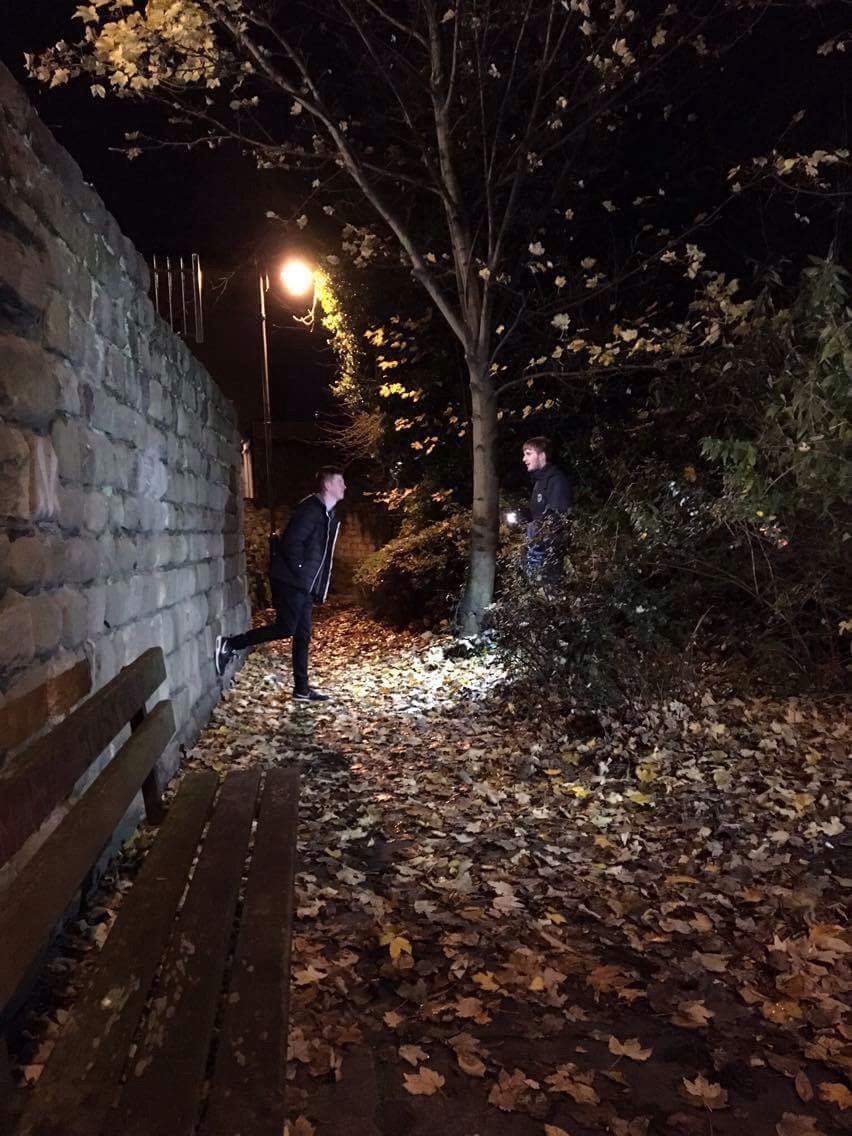
The Temptress' Control


We made sure to include lots of scenes where 'the drug' is controlling the male character. This is especially shown when she pulls him down a dark back alley and we see him following her. We also made sure in the kissing scenes that she is pulling him in. We directed our actors in this way so we could present our male character as being totally under the control of the drug, inferring that his addiction has taken over him.
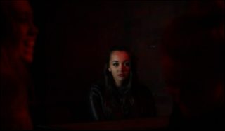
The Lighter Scene


In the scene with the lighter, it is very dark with the flame being the only source of light. We see two shots of just the lighter, and when the final shot appears, it seems to again be just the flame, however the female character becomes clear as she moves into the light and then blows out the flame. The battle of addiction and sobriety represents a battle between dark and light happening within our male character. The drug blowing out the flame represents her dismissing the light. Therefore the dark (the addiction to drugs) wins. 

The Broken Man


In this shot we chose to use a broken mirror. This is because as his reflection comes into focus we see that its is distorted and cracked due to the broken mirror. It shows that although he looks fine on the outside, inside he is broken due to the constant battle with the addiction. This indicates that when reflecting on himself, he knows that he is broken inside but does not want to accept it.

 He Can't Get Rid Of Her


In this scene we tried to show our male character having a 'bad trip'.  We did this by showing discomfort through close ups of his face and we also used a POV shot of him looking at the female character and she appears blurry and fuzzy, showing that he has taken too many drugs.  He then shoves her out of his room in an attempt to stop the drug from making him feel any worse.  Nevertheless, as he turns around the audience can see that she is still in the room.  This was the first real moment where the audience can infer that she may not be real, because as long as he is feeling the effects of the drug, he can't get away from her.

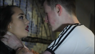
The Club And Relapse Scene


In this scene the main character is seen going to a club with his friend.  Once he is inside, he gets a drink and looks to his side to see 'her' looking back at him.  He instantly looks away.  The fact that he turns away from her and that they are not actually interacting shows that he hasn't yet taken any drugs however is being tempted to take some. He proceeds to drink shot after shot thinking it may diminish the need to take drugs however it makes him more weak and vulnerable. When he slams his last shot glass down, the video starts to go in slow motion and we used a POV shot to show that when he lifts his head, he can see her again and everything else is blurred out.  We also added a high pitched sound of tinnitus to create an uneasy feel for the audience.  She walks away but turns and directs him to follow her.  He finally gives in to his temptation and follows her into the toilet.  When they start kissing in the toilet this represents him taking the drugs. Shorty after this however, we see him get angry and agitated at himself and her, so runs away. 

The Killing Scene/Conquering His Addiction


We see him running from what appears to be complete darkness into the light of the tunnel. This hints at him choosing light over dark and foreshadows him choosing to get rid of the drug addiction all together. We see her approach in a series of jump cuts where she seems to just appear. She then starts trying to get his attention and for him to look at her but he pushes her off of him and they stand up face to face. This intense moment where they stare at each shows the final battle of her control now that he has found the power to get rid of her.


He then quickly slams her against the wall by her throat and proceeds to strangle her.  At first the audience may feel that this is very violent however we used parallel editing to show our main character also tidying up his life by cleaning his disgustingly messy room and getting rid of all of his empty alcohol bottles. In the final shot of him killing her when we see him slam her head against the wall, we also see him flushing his drugs down the toilet, which is a key shot to explain that he doesn't actually kill her but kills his addiction.  Because he has tidied up his room and flushed his drugs down the toilet, whilst at the same time showing that he has 'killed' her.  The audience realise that he is effectively conquering his drug addiction and finally removing her from his life.


Just to further remove any confusion as to what exactly the female was, our main character looks down to the floor of where he just strangled her and walks away.  The camera doesn't follow him and instead stays in the same position, then pans down towards the floor where the audience would expect to see her lying.  However, this is where the audience would completely understand what the female was representing, as there is absolutely nothing on the floor where she should be lying dead.  This concludes that he did not just murder someone, he simply 'murdered' his drug addiction and she was never real in the first place, just a figment of his imagination, a metaphor for what a drug addiction can feel like.  This links to our initial idea for the whole video, the old saying that 'love is a drug'.  By this we mean that drug addictions can, in many ways, be very similar to the addictive prospect of love, and therefore very difficult to get over.

To conclude, we used many of the shots above because in our rough cut feedback, one of our issues was that the audience didn't fully understand the narrative and were slightly confused as to whether she was or wasn't real,  or whether they were just in a rather abusive relationship.  Some people even thought we were making our main character out to be evil by killing his girlfriend at the end of the video because he was insane.  But after improving on the rough cuts and using the shots above, our narrative became completely clear.

Thursday 24 November 2016

What's next for Urban Rapture?

Now, we're all turning our intentions to producing our bands album advert and digipack. So far, we have began to put some ideas together as to what we would like to do. From our early thoughts, we have decided to use the triangle from the bands logo (which you can see at the top of this blog) to be incorporated into either the digipack or the advert. We have not quite decided how we would like this to fit into the composition of our shots but we've planned this out physically by using each other to model where band members may stand in the image. This really helped us all get a good, visual idea about how we want the bands image to look. 

At this point, we're thinking about using a dark/black background with a neon triangle (which we will create in Photoshop) behind the band members for the advert. 'this fits to our brands image and as it features part of their logo will create a band identity. This means the red neon triangle will become a recognition for the band. The band members will be zigzagged, having Alex (the tallest) at the back to try and level the height. Their body language will be quit slumped and sunken or standing tall and proud. Also, their facial expressions will either be very serious or very 'cocky.'

We have already started to plan out some paper based brainstorming as something to reference in our process through making the digipack and advert. Here are some images of what we have so far.


Tomorrow, we're going to experiment with composition to see what we think looks good and works with what we are now trying to achieve.

Wednesday 23 November 2016

Judgement Day! I mean Deadline Day.

So here it is, our final video. We have spent the most part of the last few weeks of our lives trying to get all these scenes filmed and edited together. As a group, we have spent more than 24 hours filming and closer to 40 hours including editing so this is something which we are extremely happy to have finally completed.

We would like to thank everyone  involved in our video, particularly Orrin, Laura, Alex, Jamie and Annabelle for starring in this final cut. Without these people being prepared to give up there time to film, our video would have been far harder to create.

Tuesday 22 November 2016

Approaching Our Deadline For The Video

As this is being written, we are just filling in the empty gaps between our narrative and filling them with performance shots. This is a good indicator for us as it means that we don't have too much more to get done by our deadline tomorrow. So far, the most problematic thing which we have had to do is finding enough good bits of band footage to put in these gaps and although it's taking us some time to do so, it is coming together nicely and dare I say it? On track.

These are all extremely positive signs as it means that our video must be getting towards finished. We are hoping to do this sooner rather than later as we must make sure that it is in the 'hand in' folder by half past four tomorrow and so allowing enough time for the video to render and export is vital to us as allowing insufficient time would be detrimental to all of the hard work which all four of us have put in.

Our narrative is all finished now and so we will be doing very little with it except some vary minor changes should we need to make them to get the performance footage to fit. This is rather fiddly but if it needs to be done, it has to be done. Essentially, we are just tweaking things slightly to make sure that our final video is our best possible video which I think is deserved, given the time we have put into it.
Here is an image of Annabelle and Becca looking through the band footage that we haven't yet used to see what we can put in some of the gaps.

Monday 21 November 2016

Digipack Analysis 4 - 30 Seconds To Mars - A Beautiful Lie

This is a digipak from 30 Seconds to Mars for their album 'A Beautiful Lie'.  The front cover shows the logo (three human skulls) of the album in the foreground and thousands of crying faces in the background.  This has been done to show that the songs in the album are going to be quite gloomy.  This also relates to their genre and the bands' image.  The colour red is primarily used which could also indicate the sorrow which is conveyed through their music.  We can use this to help with our digipak design as we will incorporate the emotions represented in our music video, into the album cover.  We will also present the band logo on the front cover as 30 Seconds to Mars have done here.
          For The back of the digipak, they have once again used red to keep up the same theme for their album.  The small white text is the track list and it has been made white so that it is easy to read on the red background.  It Is also another colour which is used throughout the digipak.  In our own digipak we will have our track list in small text.  However, we will have an interesting image as the background to represent our theme.
          The inside page is another logo/design.  This design is quite intriguing as it utilises symmetry whilst having an 'X' in the centre, almost as if to infer that the contents of their album are important and the 'X' marks the spot.  We will use a relevant image on the inside of our digipak, but not a different logo.
          The discs have once again used and 'X' to follow up with the representation that their songs are some kind of treasure.  They have also used black, red and white as these are the colours that are present throughout their digipak.  This makes the digipak attractive to the fans.  We are going to use an image that speaks for our video and albums' vibe.
         

Sunday 20 November 2016

Fourth And Final Day Of Filming Our Narrative

I am writing this post now as I have just got in from filming this evening at 12:30 at night. So to start off. we started to film around 6pm and didn't stop until around an hour ago. The footage we got was mostly from under the King Edward bridge, we also filmed on the quayside itself. It was absolutely freezing!!! Nonetheless, here is a little condensed description of what we got.

We also finally got round to re-shooting the killing scene which we filmed near the metro stop in Jesmond which was a rather grotty subway. It would have been relatively quick to film. however Laura couldn't help but laugh while being strangled which was understandable given how tense this was to film. What I do know is that this will look more realistic than the rough cut attempt and will seem a lot more clear than the somewhat unclear previous version.

At King Edward bridge, most of the shots we got were for the drug dealing scene. We had to film this several different times from different angles and do multiple takes in case one wasn't good enough to use. We also did a lot of edgy walking shots, in which getting the lighting right was crucial as time was against us and the cold temperature meant that we wanted to get everything done as quickly as possible. We also had to wear some safety proven clothes in the shots where we were smashing bottles against a wall as we had to get dangerously close to the wall in order to have been able to capture it on camera. 

At the Quayside, we shot some aesthetic based shots of Orrin walking along the riverside with the Millennium bridge in the background. This location is supposed to represent how he has finally come out the other side of addiction and is far happier for finally being able to give up his drug. This will create a calm ending to what is a very tense narrative.

Here are some photos from this shoot.


Saturday 19 November 2016

Digipack Analysis 3 - Paramore - Riot


The style and design of this digipak helps to reflect the name of the album, 'Riot'. It is all very chaotic with text filling all of the blank spaces. This is done on the front and back cover as well as the inside left cover. I think this is most effective on the back of this digipak because the back has the tracklist on it. The way in which this has been done is really creative as the messy, chaotic text format is still there but it has been made clear where the tracklist is because it has been put in red font. This immediately attracts your attention and draws your eyes straight to the tracklist, which is one of the most important features of a digipak because this is ultimately what people want to know before they purchase the album.

In terms of the images used, there are 2 band images, on the front and back of the digipak which are the 2 out of the 4 sides the consumer is able to see before they have purchased the album. This clearly shows the consumer who's album it is since the band name isn't really as prominent on this example. The way these images have been edited is also quite interesting as it has a comic book-like picture and it's all in black and white which has connotations of contrasts between dark and light, good and evil etc.

Having an image of the band on the front of the digipak isn't something we have come across very much in our genre when we have been doing research, however it works really well here and makes it really clear who the artist is. This proves that although an idea is unconventional, it can still work well on a digipak when well executed and it's this which keeps our options un-restricted when it comes to our own digipak.

The colour scheme is black, white and red. This is quite a basic colour scheme but it works really well for this particular digipak. White and black, as I said has connotations of the contrasts of good and evil, and red can have connotations of anger, lust, passion, love etc. In an album with the title 'Riot', this can be quite interesting to think about because white and black are obviously complete polar opposites and things that are so far apart, usually don't go together well, hence a riot. In terms of the red, lust and anger can also have connotations of arguments and rioting if you think about it in a certain context. This has been very well thought through and it is very clear from looking at this.

In terms of the font style used, it is very messy and not clean cut. There is also a huge range of font sizes used, which I think again communicates the unstable nature of the songs on the album and therefore represents the overall theme of the digipak extremely well. From this, we will consider a range of different fonts before we make our digipak in order to ensure that we give our text the desired effect.

Overall, I think this digipak is really effective in the way that it uses its appearance to represent and communicate the main theme of the album, which is normally based on the single in the album. This is something we will have to think about when we look at creating our own digipak. We will have to really discuss whether we include an image of the band on the front of our digipak because from our research, this is not conventional so whether we decide to stick with conventions or subvert them is something that needs a lot of thought beforehand.

Friday 18 November 2016

Digipack Analysis 2 - Imagine Dragons - Smoke and Mirrors

For our second analysis, we decided to choose Imagine Dragons to give us some more ideas for our own Digipak. Unlike the Fall Out Boy album, this front cover doesn't actually have any images of the band members at all, instead it has artwork which is not only eye-catching but makes whoever looks at it try to understand it's meaning and significance. To be able to go down this route rather than actual band members is a possibility for us if we can think of a representation and meaning we want to present that also links to our album title and bands image. If not we will use a master shot of the band. 

The font for Imagine Dragons has their trademark logo as well as the title of the album. By maintaining this, the logo creates a sense of familiarity to those who see it which improves the overall product in terms of professionalism. From this, we would need to establish our band logo by putting it into our Digipak, Poster, Trailer and even our music video.

As for the back of the album, the design is visibly more professional-looking than the previous Digipak as although it may look more basic by what is physically there. However, this displays the tracks very clearly in small but very bright lettering with a + shape behind it. This is a prime example of what a modern album cover of this genre looks like for this genre.

Overall, this Digipak can be useful to us as it has everything which you would expect from a video and follows a number of conventions.

Image result for imagine dragons smoke and mirrors album coverImage result for imagine dragons smoke and mirrors album cover

Thursday 17 November 2016

Digipack Analysis 1 - Fall Out Boy - Take This To Your Grave

In order for us to design our Digipack, we must analyse a number of already existing ones to ensure that we follow the conventions expected of a music video of this genre. To do this, we have started by choosing a Fall Out Boy album.

Immediately, as you first look at this, you notice that the mis-en-scene is in such as way that the colour of the font is a light blue colour whilst the image of the band itself is a green / turquoise colour. This is slightly unconventional as this isn't a pallet which you would associate with an album cover. However, due to the image being a master shot of the band sitting on a sofa, the colour scheme gives the image an almost black and white effect which works really well and reflects their moods.

The composition of the video is also very important as it essentially makes the cover appear the way it does, using the rule of thirds and a low angle well to put whoever looks at it on their physical level as it is shot at the head height of the band members.

The back of the album appears to be fairly conventional, but appears to be fairly basic in terms of design. The tracks are listed in a similar light blue to the front of the album and are in a fairly standard font which seems a little too dull for what we are going to try to achieve.

The images on the back of the album are pretty bog-standard close-ups of the band members. These appear to have been an after-thought and they don't really add a great deal to the overall appearance of it. There's also a URL for the band's website, a barcode, credit for the producer and the label name. This really doesn't appear anything out of the ordinary and so apart from the front cover, in general, I don't think that this is one of the better Digipaks which we have seen and that our other analyses will have more to offer in terms of design and originality.

Image result for fall out boy album coversImage result for fall out boy take this to your grave album back cover

Third Day Of Shooting Narrative

So this evening, we shot part of the footage within the bedroom with just Orrin as Laura was unavailable on that day. This meant that we had to shoot all of  our shots without her in order to make the most out of our time. Fortunately, a lot of our shots involve Orrin showing his addiction which worked well in our favour, leaving only a few more scenes to do with Laura.

The shots which we captured were mainly of him lying on his bed and looking extremely depressed with his addiction. To show this, we used the fixed lens to get the highest quality close-up shots, allowing us to really focus on his face so that his emotions are extremely clear which we had lacked in our rough cut.

For the most part, we used the heavy tripod as it gives us stable shots whilst allowing us to film panning shots steadily. The exception of this was when we used to shoulder mounts to film shots which needed to be filmed with a moving camera. 

In general, today's shooting went extremely well and has put us in the position where in terms of the bedroom scene, we just need to film the shots with Laura in it. This we intend to film on Saturday as well as all of our outdoor shots in Newcastle.
 
Here are a few images we took whilst we were filming.


This was the behind the scenes of one of the killer shots in our video. This shot is an over the shoulder shot that starts focussed on the back of Orrin's head, and then the focus is changed to reveal Orrin looking at himself in a smashed mirror. We originally had this shot in a normal, not smashed mirror in our rough cut, however we think that the broken mirror comes with more visual signifiers in order to link in with the theory by Ferdinand de Saussure. We feel the broken mirror reflects a broken man and a broken personality which fits in really well with our narrative.


Here you can see we attached an LED light to the top of the camera so that we could easily adjust the light and also point it directly at the area or person we were shooting at the time. This made lighting much easier and was also 1 less light for someone to stand and hold.


What Do We Still Have To Film?

As it stands, we still need to film scenes with Laura and Orrin at the new bedroom location which we tried to do on Friday but failed (see previous blog post), all of the drug dealing scenes, this includes shots of Orrin walking down a path, under a bridge, drinking "Vodka" and throwing glass bottles and walking down Newcastle's Quayside.

We now have approximately just under a week to finish filming and we plan to use three of those nights to film the rest of our narrative. This should be hopefully all done by Saturday or Sunday at the absolute latest, giving us all 3 days to complete the editing process to polish our video.

We are pretty confident that we can all run to this time frame and unless one night of filming goes terribly wrong, we have this music video done and dusted in good time.

Wednesday 16 November 2016

How Our Narrative Footage Looks So Far

Our gut instinct before we had even played our footage back was that it would be way too dark to be usable. This was due to the fact that the settings which we had had to use meant that we had to make a compromise between darkness and graininess. However, fortunately, this morning when we checked our footage, we found that although it appears fairly dark, the quality of the footage seems extremely high quality as a result of these settings.

Out of the footage which we have shot, we do not at this point think that we will have to re-shoot any of yesterday's footage as we feel that we were sure to re-shoot our shots to ensure that if one shot wasn't good enough, that we would still have more footage to go on, preventing unnecessary extra days of shooting.

As of now, we will be adding this footage to the final cut and see what it looks like when that's done. We will decide then whether it is good enough or if we need to re-shoot the odd shot again.
From looking through the narrative footage, we have tried to see what elements of Propp's 31 Narrative Functions we have managed to include and that are really clear in our video.
Complicity - this function states that the trickery of the villain (Laura) works and the hero or victim (Orrin) acts naively in a way that helps the villain. The way that we have created this in our narrative is through the relapse scene in the club. The actions that come from Laura as a result of the drugs causes Orrin to fall into her trap and then comes his bad trip right before he decides to kill her and get rid of the drugs.
Mediation - this function talks about how the hero discovers the act of villainy and is dispatched from it. We think that this is clear when Orrin realises that he is relapsing in the toilets in the club. He follows Laura to the toilet, they kiss for a little while and then the realisation hits that he has fallen back into her trap and relapsed on the drugs.
Beginning Counter-Action - this part is about when the hero acts in a way that will resolve the villainy and defeats the villain. This is the most crucial part of our video as this is the moment where Orrin kills Laura as he is getting rid of the drugs. This is the eureka moment in our video that tells the audience exactly what the whole narrative has been about and so this is a very important moment in our narrative.
Overall, we are confident that the way we have used these elements of Propp's 31 Narrative Functions has really helped us to communicate our narrative as clearly as possible.


These shots were taken in the house as Orrin goes out to collect his drugs from the dealer. We are really happy with how these shots came out in terms of the lighting etc. in comparison to the rough cut lighting in the bedroom scenes.


These scenes were taken in the alleyway and as Orrin is led into the alleyway by Laura. We are really happy in the last shot shown here in particular because we think the lighting is really effective as well as the expressions on their faces. They show how happy Orrin is to be with Laura and Laura's facial expression shows the almost evil concept behind the video which we really wanted to achieve.


These last 2 shots were from our nightclub scene. We are much happier with the shots we took this time. We have decided to keep some of the shots from the rough cut and edit them in with the new footage. However, we are so much happier with this new footage having used different lenses and getting much more different angles of the same shots which we think will be much more effective.

Advert Analysis 5 - The 1975

For this The 1975 advert, it is immediately noticeable that the black and white colour scheme makes it's design work. This is due to the extreme contrast between the images and font and the background which gives it an almost timeless effect as a colour pallet used on an advert can often show it's age. This therefore could be 2 or 20 years old and not appeared to have aged very much at all.

The font for The 1975 is similar to if not the same as the font which they use on their gigs and some of their albums. This font not only looks good but it also reinforces the logo and it's image as a whole. This is something which we will try to do ourselves between our advert and our digipak, creating a sense of familiarity for those who see either.

The image itself is a fairly standard 4 shot which you would expect from an advert and so although it is basic, it's a conventional shot which clearly displays all of the band members' extremely moody expressions. The attire which they wear is also conventional of a band of this genre, wearing jackets and hoodies which looks right for the type of band that the poster is representing.
 
In terms of the information that is included on this advert, it is kept to a minimum and is very concise which is effective because it tells the consumer everything they need to know without including so much text on the page that it becomes overpowering.

Overall, the biggest thing which we should take away from this poster is the use of colour as choosing colour (or there lack of) as the use of it here makes it not only seem very clear and concise but also quite artistic in the way that the white background blends into the image behind perfectly.


Tuesday 15 November 2016

Advert Analysis 4 - Kasabian

This is the advert for Kasabian's creatively named 'Kasabian' album. As you can see, the main image is artwork rather than a shot of the band and what I particularly like about this is how the blocky style of the font and main image uses dark and light to give it the look of something which greatly resembles soviet propaganda from the 1940s. It is this idea which they have played on and the consequence of this is that it is striking but also quite imposing despite the lack of colour.

This, like real propaganda, is very eye-catching and by having an image which requires you to pay attention to it to understand what it is. It's very effective in doing this and  so works well as an advert in that respect. The originality of this image also sets it apart from other adverts well which is what makes it work and seem like professionally done poster.

Underneath the image, the advert has more information about the album which although could be argued isn't maybe necessary, lists their most popular songs in order to jog the memory of the reader and persuade them to get the album. It also says in smaller print which of the formats the album is available in which is a nice touch.

In general, this advert serves to prove that adverts can be just as successful for having artwork as it can having band members in it. We ourselves may go down either route depending on what we all visualise but are both equally as viable at this point in time. However, whatever we decide to do, we need to make it original yet conventional. 


Second Day Of Shooting Our Narrative

Today's filming has proven to be far more successful than our last attempt on Friday as we managed to re-shoot our time-lapse from Newcastle's Millennium bridge as the sun set which should be a great improvement on our previous shot as composition of it wasn't what we wanted. This shot also showed the colours which were emitted from the Millennium bridge whilst the camera was rolling, this should look excellent when we speed up the footage as the colours change over a 20 minute period.

Secondly, we filmed the scenes in the alleyways, this took us particularly a long time as we had to ensure that the lighting was as best as it could have been due to how little natural light that there was. This went well and we feel like we have addressed the criticisms of there not being shots close-up enough to the characters' face and that we weren't being creative enough with our angles.

Finally, we re-shot our nightclub scenes in which we had to create the effect that there were more people in there than there actually were by placing two people, out of focus in the foreground of the shot which not only worked but also shifts attention to Laura's character as she is the only one in the shot who is in focus.